Logo Design for Health Food Store
Designing a logo for the health food store Zdravíčko was a great challenge for me. I was aware of the 20 years of history and tradition that this shop in the centre of Turnov has, but at the same time I wanted to bring something refreshing and innovative to its new logo.
Most businesses that sell products to promote a healthy lifestyle use pictograms of leaves, fruits or vegetables in their graphic identity. However, I wanted to take a different approach this time. After all, in small towns, people shop at local stores not only because of their product range, but also because of the personal touch and service they provide. I had the advantage of knowing the owner of shop, so I tried to make the logo somehow refer to his cheerful mood and all-round positive approach to life.
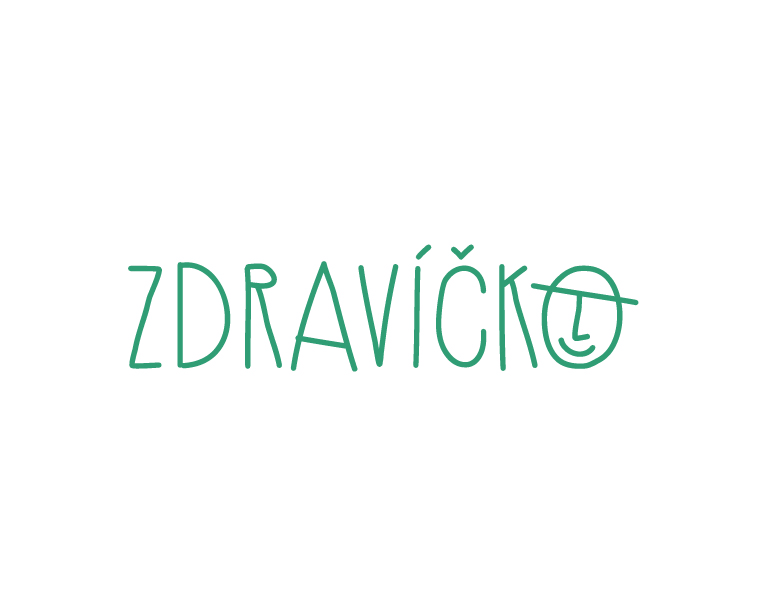
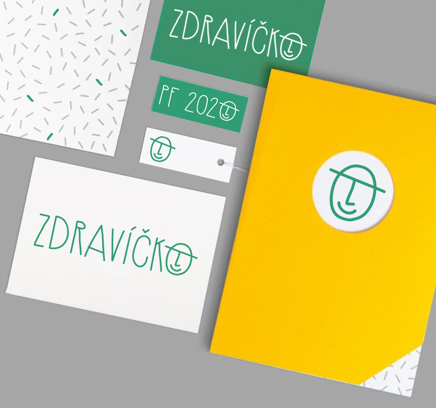
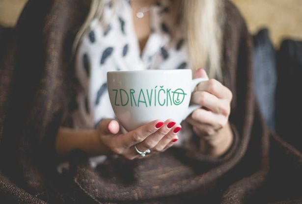
From the several options I presented, he chose what I thought was the best one – a subtle handwritten font, the letters written in capitals and rendered in soft and elegant, slightly uneven lines. I added a few extra strokes to the last letter to give the impression of a gentleman with a bowler hat and a smiling face. The letter “O” thus became a simple pictogram that can be worked with further in the future and on its own.
