Highlighter Design
The highlighter collection was created as part of a design competition for the Czech company Centropen.
I started thinking about situations where people reach for a highlighter. Usually it’s when they need to highlight or mark something in a particular section of text to make it easier to find or remember that section later. The highlighter thus becomes a useful tool for studying, which, of course, we must concentrate on fully.
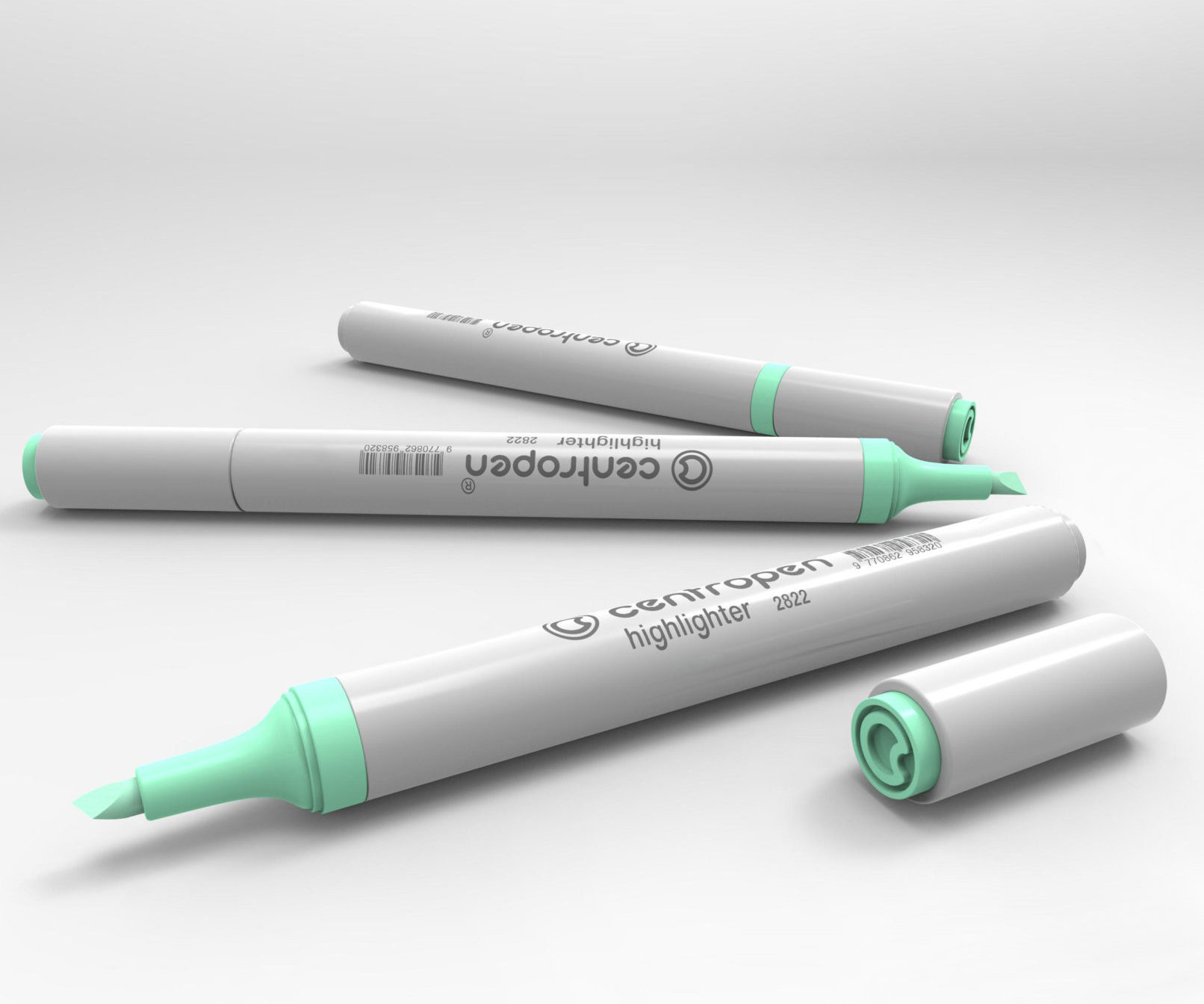
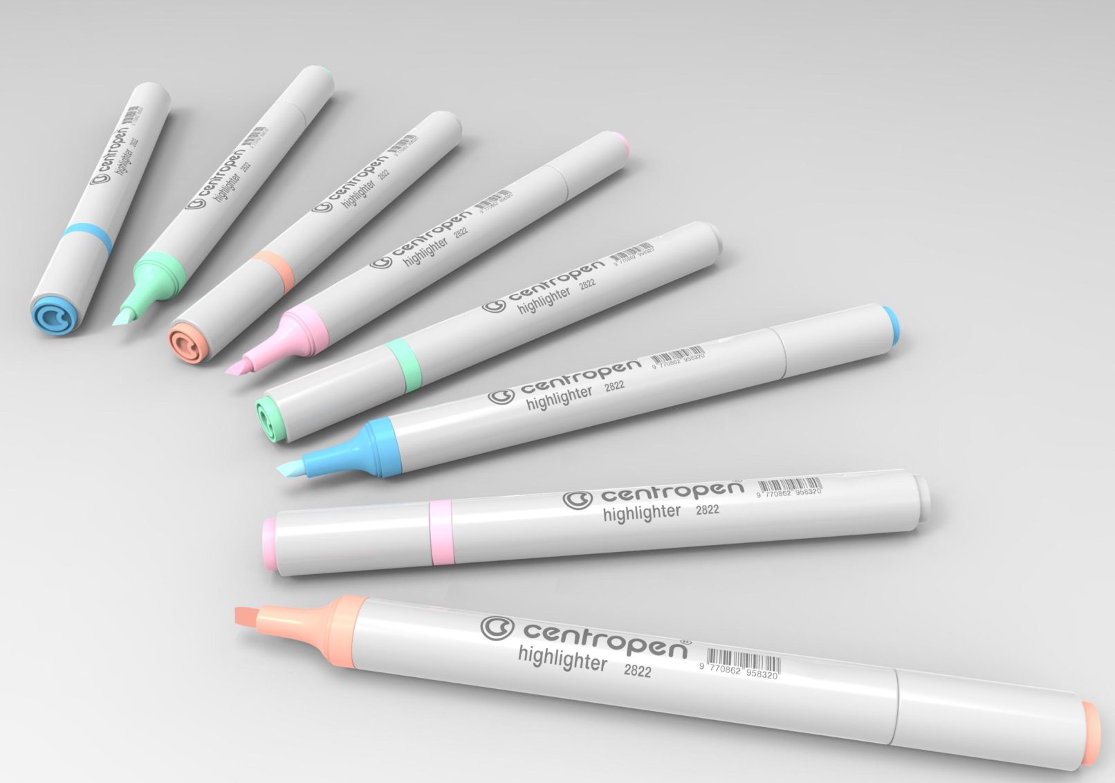
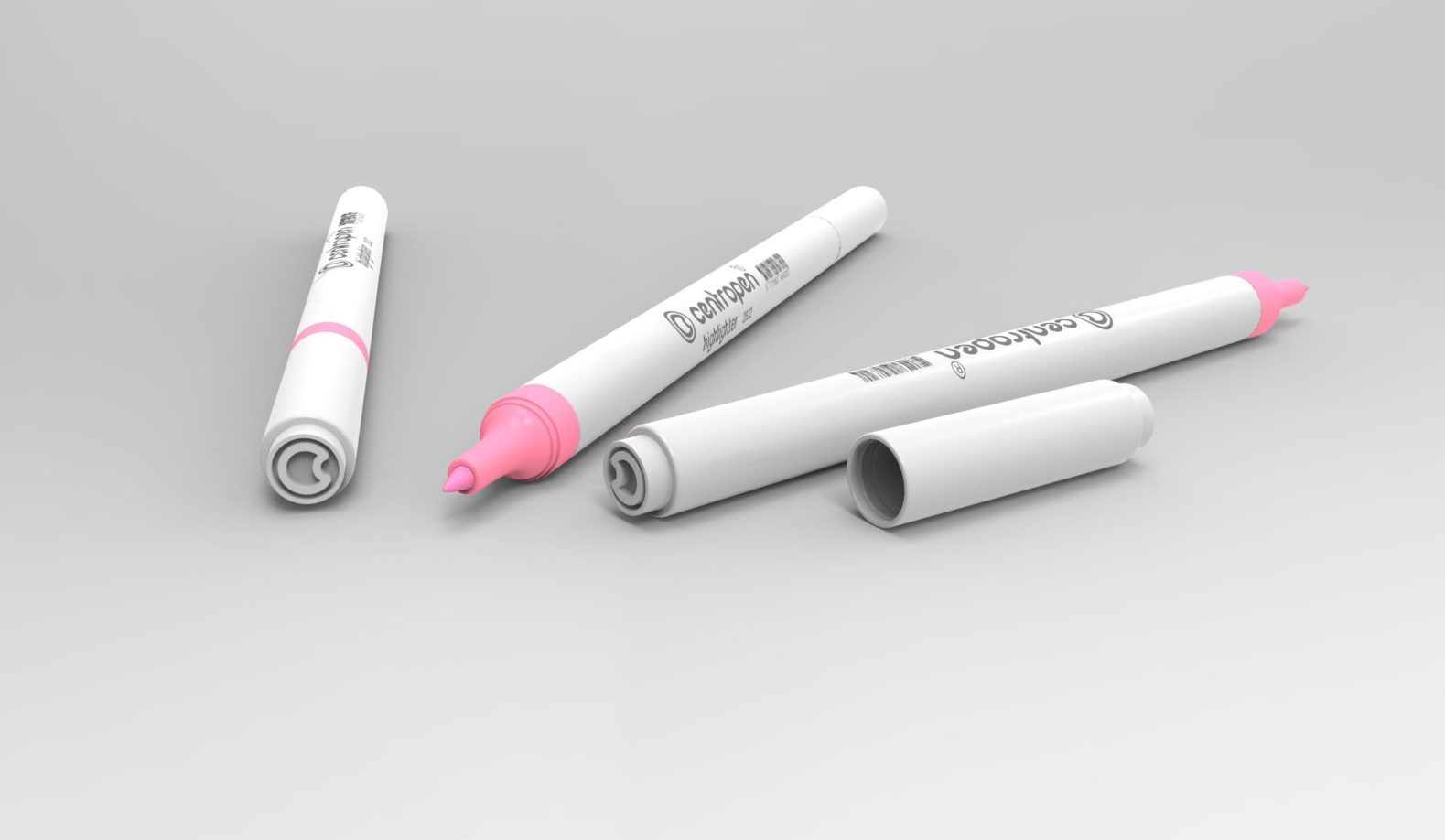
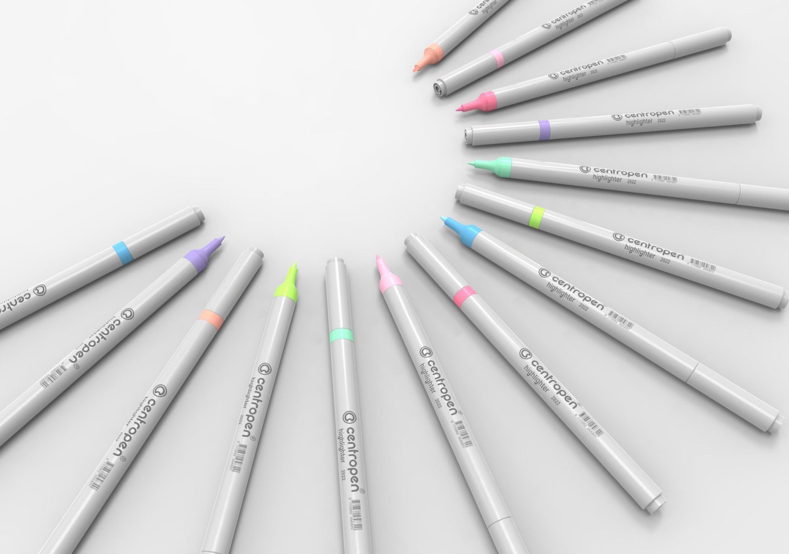
The result of my work is therefore an unobtrusive and discreet aid that aims not to distract too much with its colours or shape. The clean grey line and cylindrical body are thus distinguished in uncomplicated contrast only by the head and the elements at either end. This also identifies the shade of the filling used. When the cap is fitted, the product resembles a modest cylinder with a small coloured ring between the body and the cap.
The barcode imprint on the product can gradually be erased during use, so I have placed a raised logo on both ends of the product – the letter ‘C’ enclosed in a circle. This element is an elegant and permanent symbol that sparingly, but with dignity, refers to a renowned company that has been active in the field of school and office supplies for many years.
